
Apecom identity
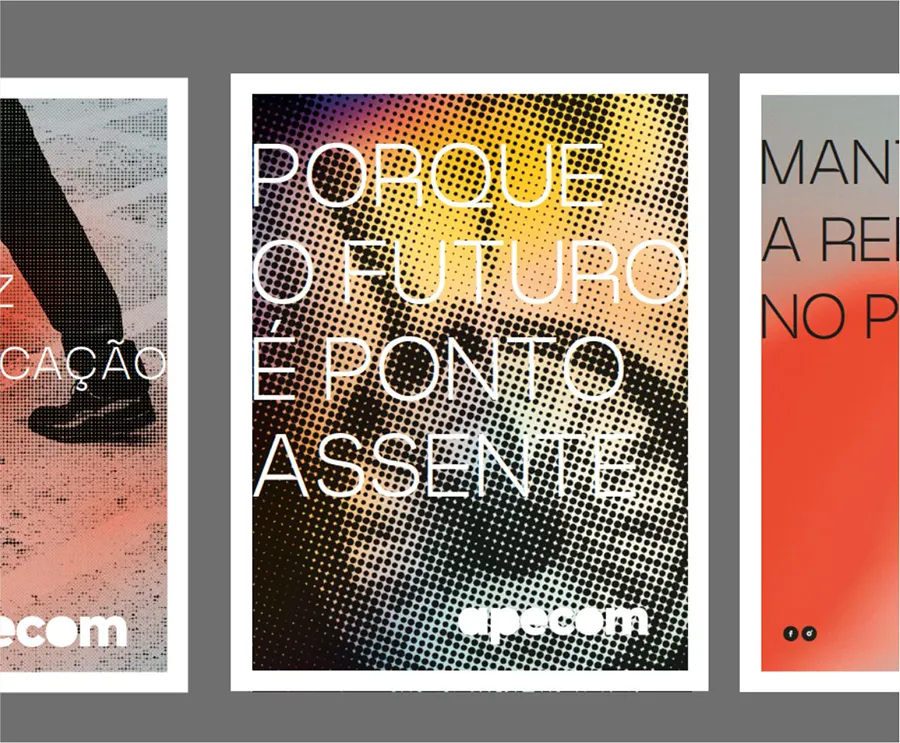
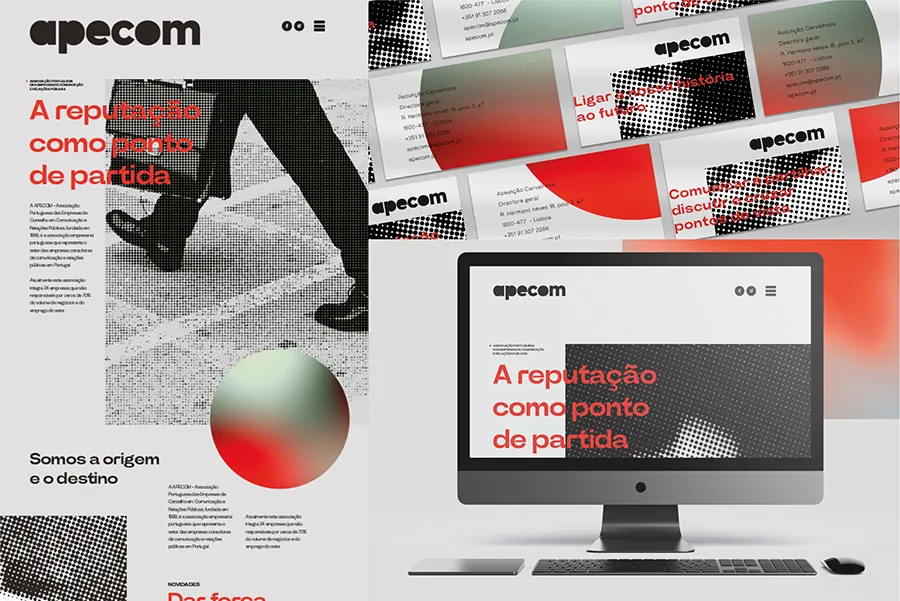
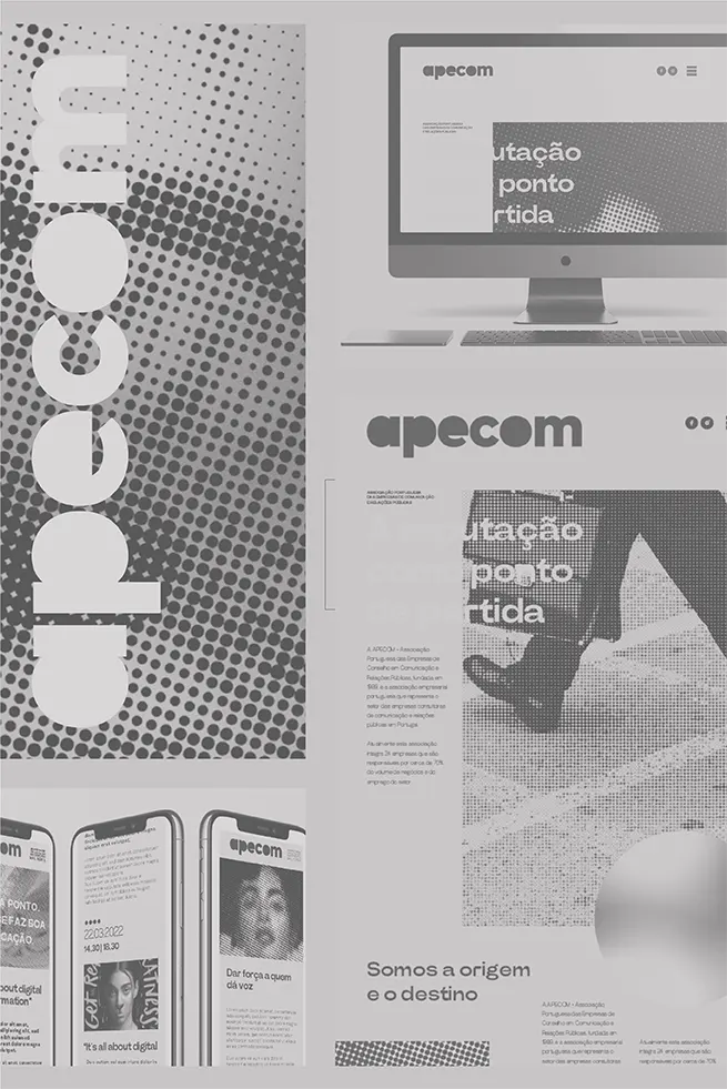
APECOM’s rebranding is based on the concept “The Dot, Evolution and Transformation,” where the dot symbolizes connection, beginning, and completion in communication. The new identity removes the dots from the letters to highlight them as central visual elements, reinforcing the idea of interaction and sharing among members. It maintains institutional credibility while adopting a cleaner, more modular, and adaptable aesthetic. In this way, APECOM reaffirms itself as a hub for connection and sector evolution in Portugal.